

Pepsi's new logo and 3 lessons on (re)branding for any organization
In March 2023, Pepsi unveiled a completely redesigned logo after 14 years. What may at first glance look like a simple visual refresh turned out to be a strategically considered rebrand. It taps into nostalgia, new organizational goals, and audience engagement. What can both small and large organizations learn from this? In this case study, we share three concrete lessons on branding and repositioning.
A new era for Pepsi
From 70's retro to modern flexibility
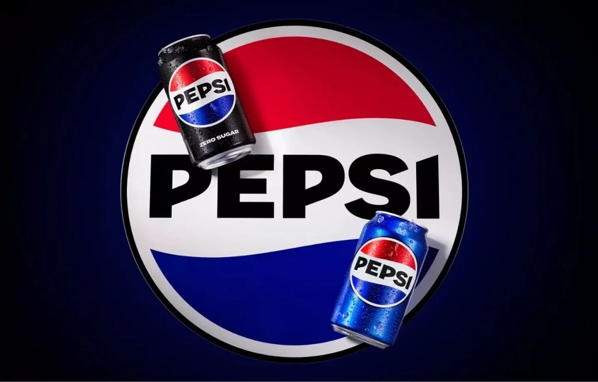
With its new logo, Pepsi deliberately draws on elements from previous decades. The color palette of red, white, and blue has been retained, but the signature wavy white line and the addition of a bold black typeface give the identity a modern strength. The design recalls the characteristic look of the 1970s to 1990s, but refreshed for today.
“For me, this is their strongest branding since the 1990s.” – Carl Stasiak, Thinklab UK
This retro style is not outdated. It taps into recognition, memory, and emotional connection—exactly what strong visual identities achieve.
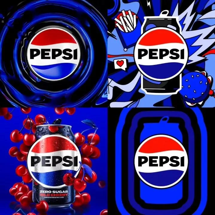
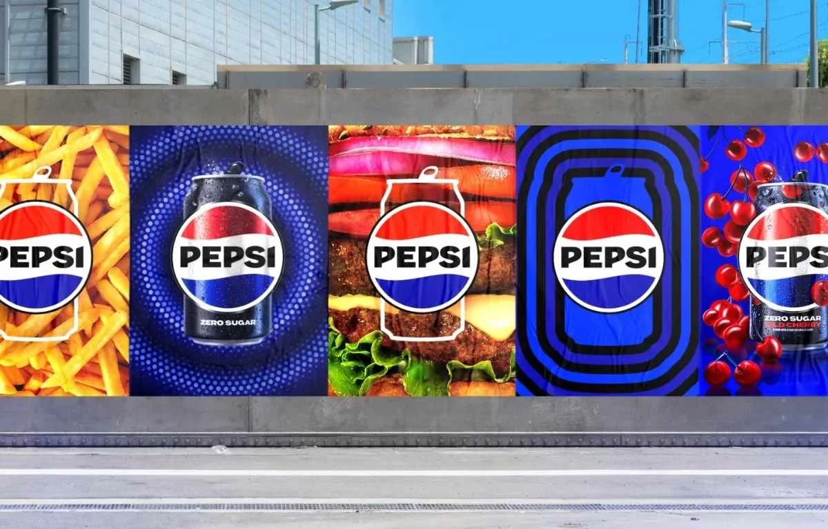
Here you can see the different steps Pepsi has taken within its brand identity.
Visual design aligned with new organizational goals.
Pepsi’s choice of black in the logo is not purely aesthetic. It directly refers to Pepsi Zero Sugar, the sugar-free product line that now sits at the center of their strategy. The new design is also used on packaging made from 100% recycled PET plastic.
This shows that visual identity is more than just a pretty picture. It tells the story of the organization’s direction. In this case: healthier, more sustainable, and better aligned with the values of today’s consumers.
Looking back to move forward
Why the 2008 rebrand failed
Not every Pepsi rebrand has been a success. The 2008 version was widely criticized: too abstract, not recognizable enough, and disconnected from the organization’s heritage. What stood out most was the leaked design report, which was full of abstract language and lofty metaphors.
It missed one crucial aspect: connection with the audience.
3 branding lessons applicable to any organization
1. Listen to your audience
Pepsi discovered that people could draw the logo from memory: a circle, the three familiar colors and the word Pepsi. Instead of taking this for granted, the organization decided to take advantage of it.
Even for smaller organizations, it is valuable to gather feedback from customers or target groups. What sticks? What do people recognize? That's often where the foundation of a strong visual identity lies.
2. Let your visual identity reflect your goals
The introduction of black in Pepsi's logo is not random. It symbolizes their focus on sugar-free products. This makes it visually clear what the organization stands for.
Visual identity is not just an aesthetic choice, but a strategic one. Do you want to appear reliable, innovative or accessible? Then your appearance must reflect that.
3. Tell your story, including visually
"Every organization tells a story, and visuals are an essential part of it," said Mauro Porcini, Chief Design Officer of PepsiCo.
Using recognizable style elements and consistent use of color that matches organizational values creates a recognizable and authentic image. This contributes to trust, recognition and long-term relationships.
What does this mean for your organization?
Branding is not a luxury reserved for large corporates. It is an essential part of any strategy. Whether you're just starting out or looking to reposition your current identity, it's all about:
Recognizability
Target
Clarity
Successful rebranding begins with vision, not with design, and culminates in a visual style that amplifies it.
Ready to reposition your organization's visual identity?
Considering a new logo or a broader repositioning? Together with you as the client, we work towards a result that is both visually compelling and strategically sound.
Get in touch for a no-obligation conversation about the possibilities.
Frequently Asked Questions about Rebranding (FAQ).
-
Rebranding is the adjustment of an organization's identity to better match its target audience or changing market trends.
-
Organizations choose rebranding to remain relevant, to engage new audiences, or to communicate changes in strategy.
-
A rebrand is successful when the story comes across clearly, the visual style is recognizable, and the audience can identify with it.
-
The 2008 rebrand lacked recognizability, had a design that was too abstract, and failed to resonate with the public.
-
Nostalgia works when recognizable elements of the past are combined with current values and goals. This creates a balance between familiarity and innovation.
-
By choosing colors, typography and design language that visually convey the organization's mission, vision and core values.