
SILKS Activewear
SILKS is a high-end activewear label designed exclusively for the woman who seamlessly balances strength and sophistication.
From a shared vision of minimalist luxury, Diana sought a brand identity that would resonate more deeply with her ambition: a brand that feels soft on the one hand, but has a robust presence on the other. Throughout our collaboration, one aspect was key: finding that subtle balance between timeless aesthetics, sophisticated sensuality and distinct character.
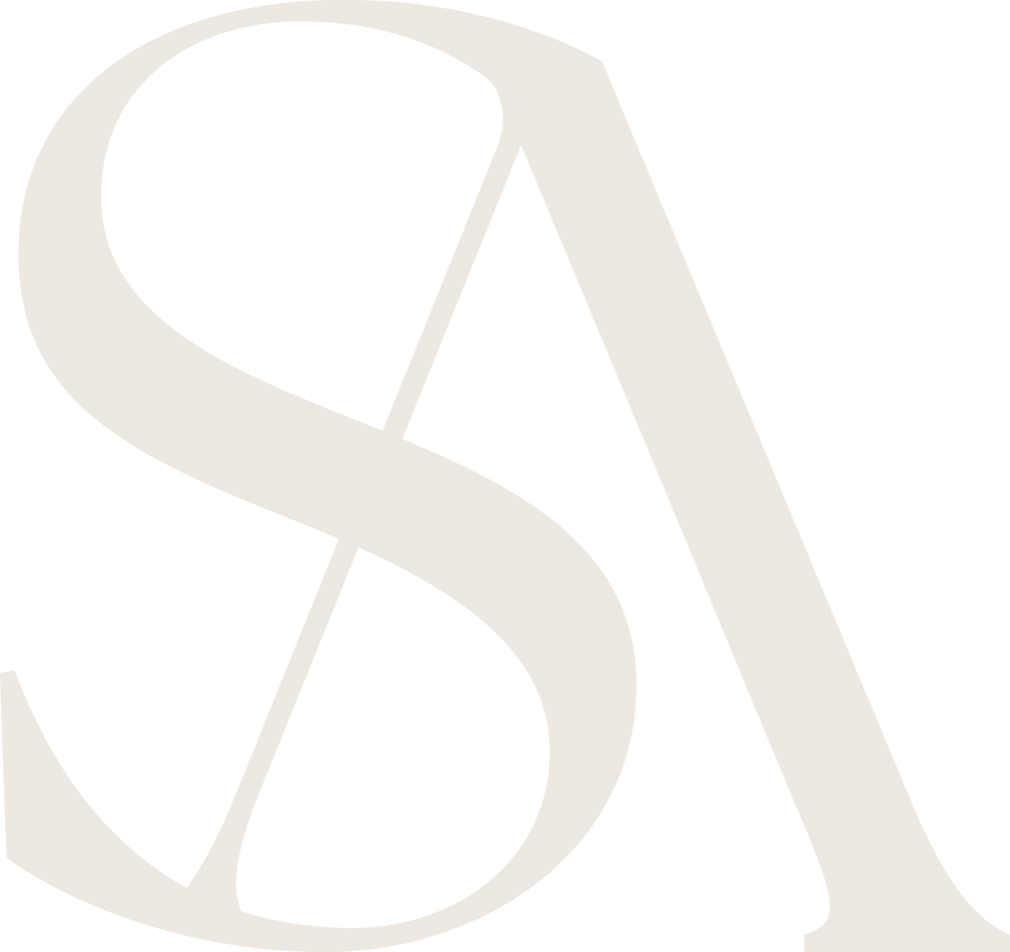
A logo that feels like an extension
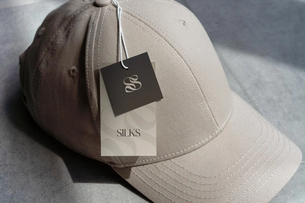
The first step in this process was to develop the logo. In close consultation with Diana, I worked on a visual mark that not only functions as a visual anchor, but also reflects the brand philosophy. The signature "S" symbol displays a subtle gracefulness that blends seamlessly with the classic, yet powerful typography. To ensure versatility, I developed several variants so that the logo is at its best in every application: from digital channels to the sophistication of apparel labels.
Telling stories through form and color
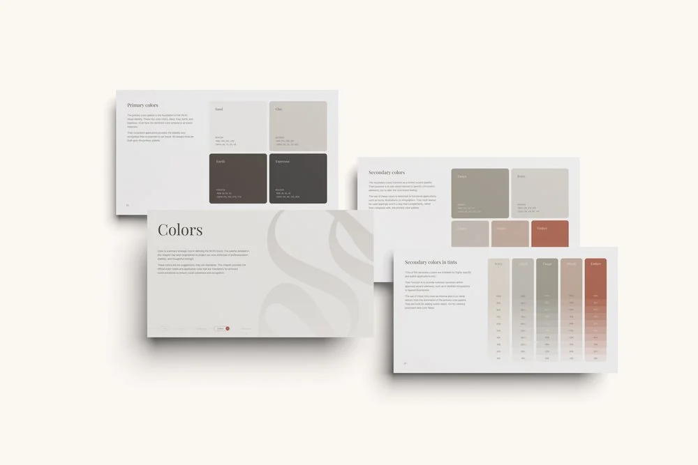
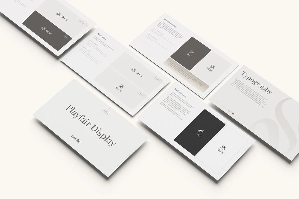
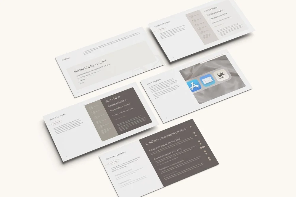
After approval of the logo, we proceeded to develop the full brand identity. The visual style is composed of a carefully chosen palette of deep earth tones, soft ivory and a warm blush color. Each color plane contributes to the layering of the brand: grounded, elegant and a touch mysterious. In addition, a clear typographic hierarchy was chosen, exuding consistency and a sense of luxury across all communications.
Documentation with depth
The end result is a comprehensive brand book that not only includes guidelines, but also explains the "why" behind each visual element. This handbook exudes style, simplicity and structure, while allowing for the emotional experience and story of the brand.
SILKS' visual identity is still evolving, with future steps focused on social content and brand activations. With this solid foundation, there is now an identity that has impact without being intrusive.