
Wasserette Haaksbergen
When Ruben Badal, owner of Wasserette Haaksbergen, wanted to give his organisation a fresh boost after more than three years, he contacted me again. We had worked together before, years ago, and although our cooperation ended back then due to changes in his services, he fortunately never forgot me. The fact that he immediately thought of me again was special and confirmed how valuable good work and pleasant collaboration can be.
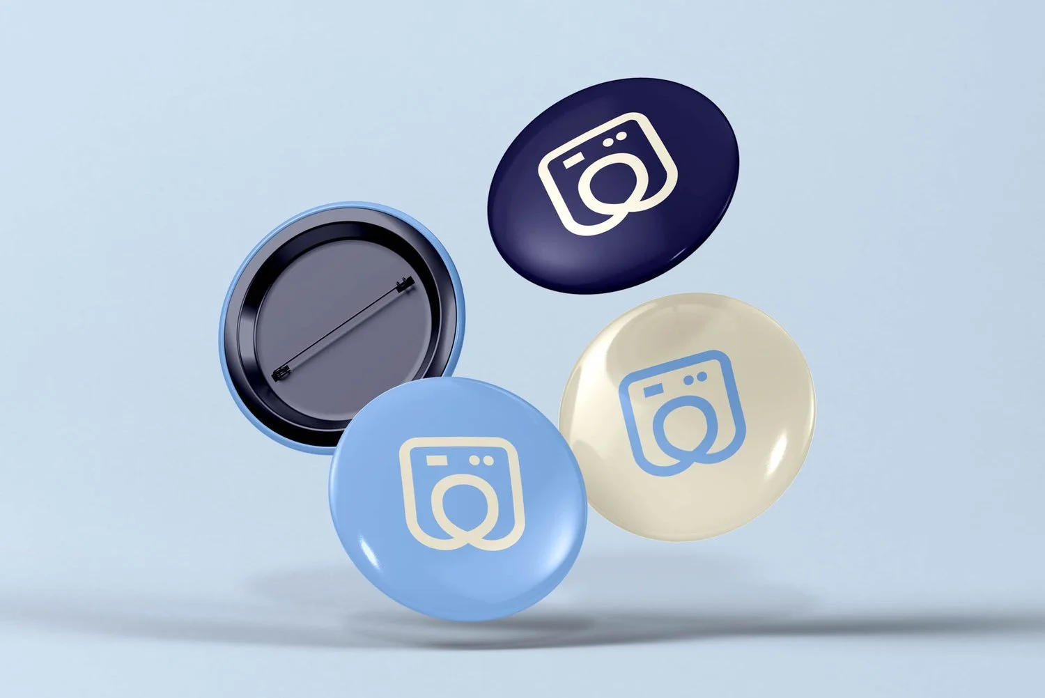
Together we developed a new corporate identity that truly suits him and his business. A friendly, clean and recognisable logo was designed, with a subtle visual reference to a washing machine, but in a modern and refined style. The colour palette radiates confidence and quality, combining warm neutral tones with a fresh blue. Everything was created with a focus on applicability and visual appeal.
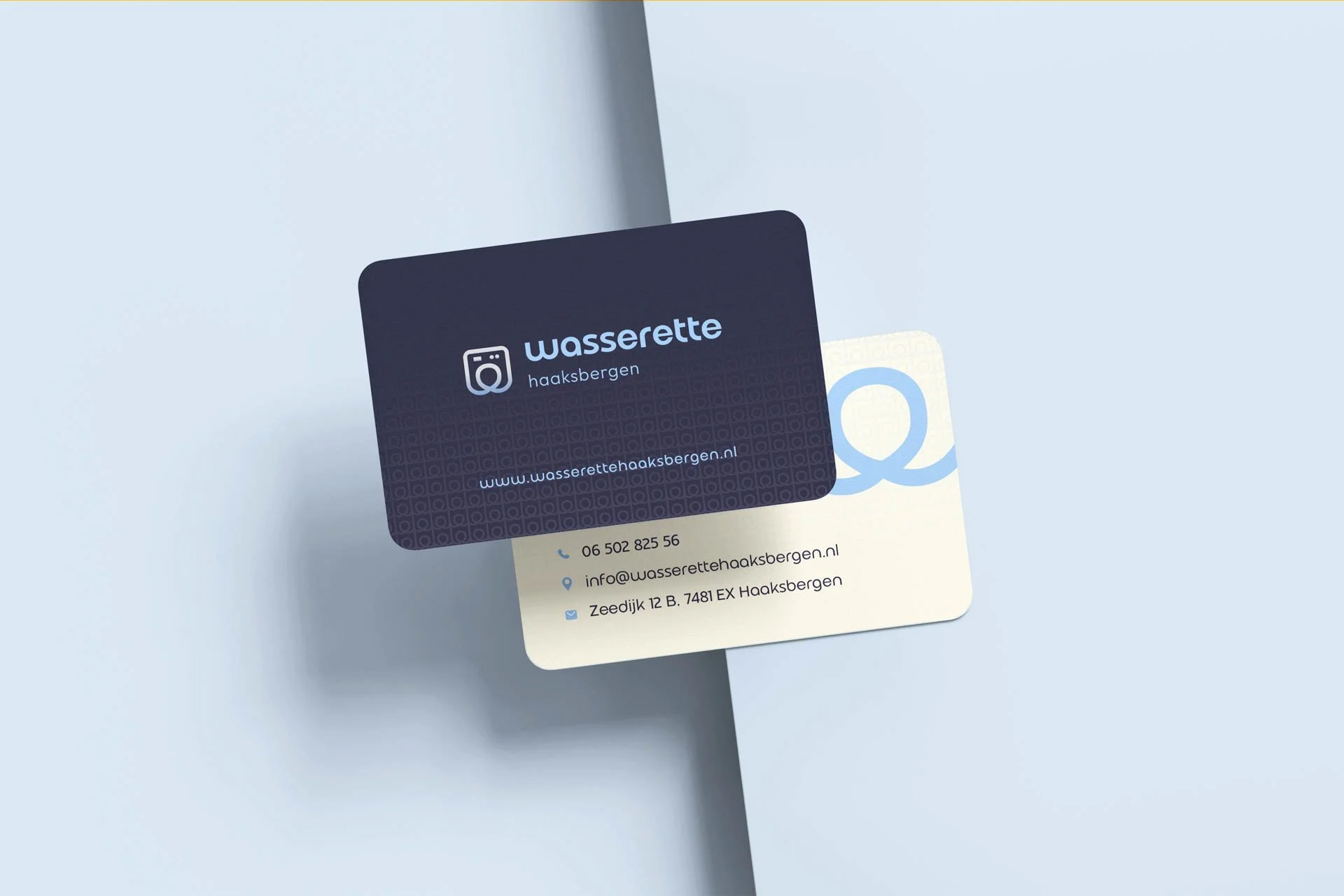
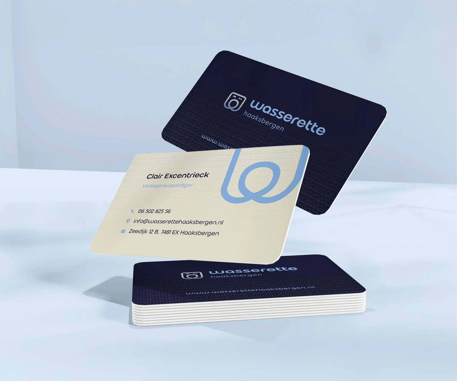
From business card to visual identity
The new business card fits perfectly with the chosen style: rounded corners for an approachable look, a subtle background pattern and clear typography that immediately appears professional. Each element has been carefully crafted to ensure the entire design forms a cohesive and strong visual.
From now on, I will be taking care of all graphic work for Wasserette Haaksbergen, something I am very excited about. It is always a privilege to design a corporate identity from the ground up and to be involved in the further rollout. I approach this with as much care and attention as the very first design, because it is exactly that personal contact and tailor-made solutions that make my work as an independent designer so valuable.