

How a strong visual identity grows your organization
A recognizable appearance makes all the difference. The visual identity of your organization determines how (potential) customers experience, remember and trust you. Whether you are a start-up or want to reposition an existing organization: a strong visual identity is the key to sustainable growth. In this blog you will discover what it entails, why it is important and how to deploy it effectively.
What is visual identity and why is it important?
Visual identity is the overall picture of what your organization looks like. Think of your logo, colors, typography, imagery and formatting style. It is the visual extension of your story, mission and core values.
Many business owners confuse visual identity with corporate identity or branding. Briefly explained:
Corporate identity is the practical application (stationery, invoices, etc.)
Branding includes all expressions (including tone-of-voice, positioning, brand strategy)
Organizational identity is the overall perception of who you are and what you stand for
A strong visual identity:
Strengthens your recognition
Exudes confidence and professionalism
Ensures consistency across all channels
Makes your organization stand out
The key elements of a visual identity
Logo / logotype
The logo is often the first visual element people remember. A good logo is recognizable, timeless and applicable to any format, from Instagram profile to building sign.
Color palette
Color evokes emotion. In consultation with the client, colors that fit the desired look are often chosen. For example: blue radiates reliability, red energy. A good color palette is versatile and functional.
Typography
Letters tell more than just the message. A clean font gives a modern impression, while a serif font feels classic and reliable. Importantly, typography must be legible and consistent.
Image Style
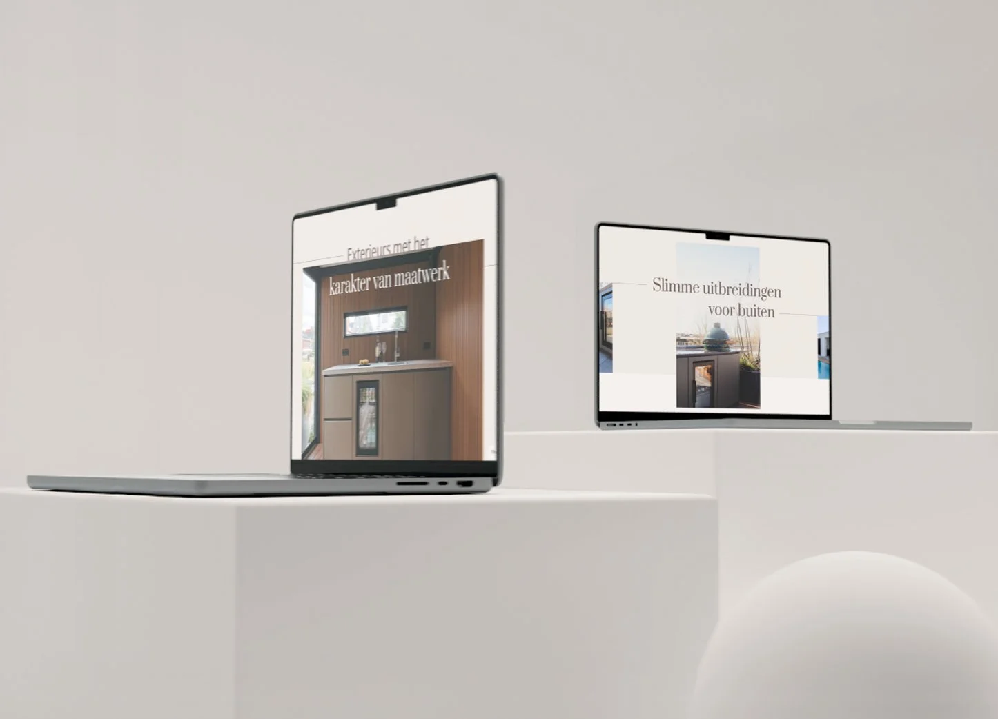
The choice of photography or illustration sets the mood. Think about filters, composition or the use of iconography. Everything contributes to the identity.
Layout and design
The way elements are positioned determines visual hierarchy. Consider white space, grid structures and scales. This makes the design visually powerful and balanced.
Inspiring real-world examples
Together with clients, several projects have worked toward unique visual identities. Some examples:
A sustainable lifestyle organization: Natural colors, soft typography and daylight photography gave the organization instant recognition in its niche market.
A tech startup: Clear lines, geometric logo and bright contrasting colors gave the organization a modern and innovative look.
A personal coaching practice: Warm tones, handwritten accents and quiet formatting supported the confidence and personal touch.

What does it cost to have a visual identity designed?
The cost of having a visual identity designed depends greatly on the requirements, the number of expressions needed and the level of customization. In practice, three levels are often used.
For a basic package, you can think of a professionally designed logo, a well thought-out color palette, typography and a simple style guide. This course usually falls in a price range of about €600 to €900.
A medium-sized project usually includes everything from the basic package, supplemented, for example, by stationery designs, social media templates and an elaborate visual style. For this, the average budget is between €950 and €1,500.
For organizations that really want to go all-in, there is a comprehensive process that includes the development of a comprehensive branding manual, photography concepts and a web design foundation in addition to the previously mentioned components. The cost for this often starts from €1,600 and can reach €2,500 or more, depending on the complexity and desired applications.
Please note that the amounts listed are guide prices. Each project is unique. Factors such as the number of revision rounds, variants needed (think sub-logos or print preparation) and the level of guidance during the process can influence the final price. Transparent consultation and clear expectations up front ensure a pleasant and effective process.
Do it yourself or outsource?
For small organizations, it can be tempting to start working on their own with tools like Canva. While that's useful for simple expressions, it often lacks strategic consistency.
Outsourcing is recommended when you:
Want to be professionally and distinctively visible
Have no time or knowledge of design principles
Looking for something scalable (for print as well as digital)
When choosing a designer, note:
Portfolio: does the style appeal to you?
Process: how does the collaboration work?
Aftercare: do you also get guidelines, files and explanations?
Tips for starting strong as a starter
Define your core values: What do you stand for? Who is your target audience?
Create a mood board: Collect colors, shapes and images that appeal to you.
Ensure consistency: Use the same colors, fonts and image style throughout.
Work with templates: For social media, presentations and email signatures.
Create a simple brand guide: Even an A4 with your logo, colors and fonts helps tremendously.
Conclusion
A strong visual identity is much more than just a pretty logo. It is a strategic tool that makes your organization recognizable, professional and distinctive. By investing smartly in design, you build trust and ultimately sustainable growth.
Frequently asked questions about visual identity (FAQ)
-
A visual identity is the set of visual elements that define the appearance of an organization. Think of the logo, use of color, typography, visual style and layout. Together, these elements create recognizability and ensure that the communication visually matches the organization's core values.
-
Visual identity is the overall picture of what an organization looks like - including strategy and creative choices. The corporate identity is its practical application, such as stationery, business cards or e-mail signatures. So the corporate identity follows from the visual identity and translates it into set formats.
-
Key elements of a visual identity include: the logo, color palette, typography (fonts), visual style (such as photography or illustrations), and layout principles. All of these components work together to create a visually consistent and recognizable look, tailored to the organization's target audience and positioning.
-
Consistency ensures that your organization remains recognizable, regardless of the channel or time of communication. By always using the same colors, fonts and image style, you build trust and increase your professional appearance. This strengthens the credibility and visibility of the organization.
-
Costs vary depending on the requirements and the number of components. For a basic visual identity (such as logo, color and typography) you pay on average between €600 and €900. More extensive processes with branding manuals, templates or photography can amount to €2,500 or more. Transparency and customization are essential here.
-
Choose a designer who has experience with your type of organization and target audience. Pay attention to the portfolio: does the style match your vision? Ask about the process: what does the collaboration look like? And check what you receive after delivery - such as files, guidelines and support. Good communication is key.
-
You create a mood board by gathering visual inspiration that fits the look and feel of your organization. Think colors, fonts, photos, shapes or patterns. Tools like Pinterest or Canva can help. Make sure the mood board is consistent with your core values and target audience. It provides a valuable foundation for your designer.
-
A strong visual identity increases your organization's recognition, professionalism and appeal. As a result, people remember you faster, take you more seriously and are more likely to contact you or become a customer. It helps you stand out in a competitive market and strengthens your positioning.