
Linizio
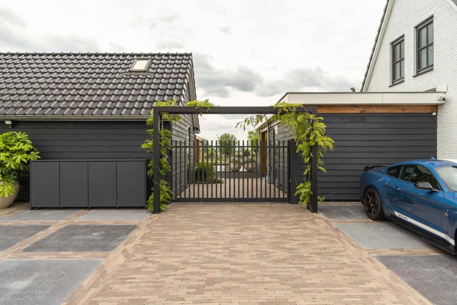
A complete corporate identity has been developed for Linizio, a new sister organization of Unicos, in line with their positioning in the luxury segment for patio covers. We worked together with the client to create a visual identity that from the first moment of contact makes clear what Linizio stands for: refined outdoor living with attention to every detail.
Part of this visual identity is the logo, designed specifically to reinforce this luxurious and reliable look.
The comprehensive corporate identity manual establishes the brand identity in color, shape and typography. The colors chosen, such as Midnight Indigo and Gold-tinted Linen, exude tranquility and class and perfectly match the high-quality products Linizio provides.
The typography combines the classic feel of Prata for headlines with the accessibility of Open Sans for plain text. This creates a balanced style that is professional, readable and visually distinctive.

A brand identity that exudes tranquility, luxury and confidence
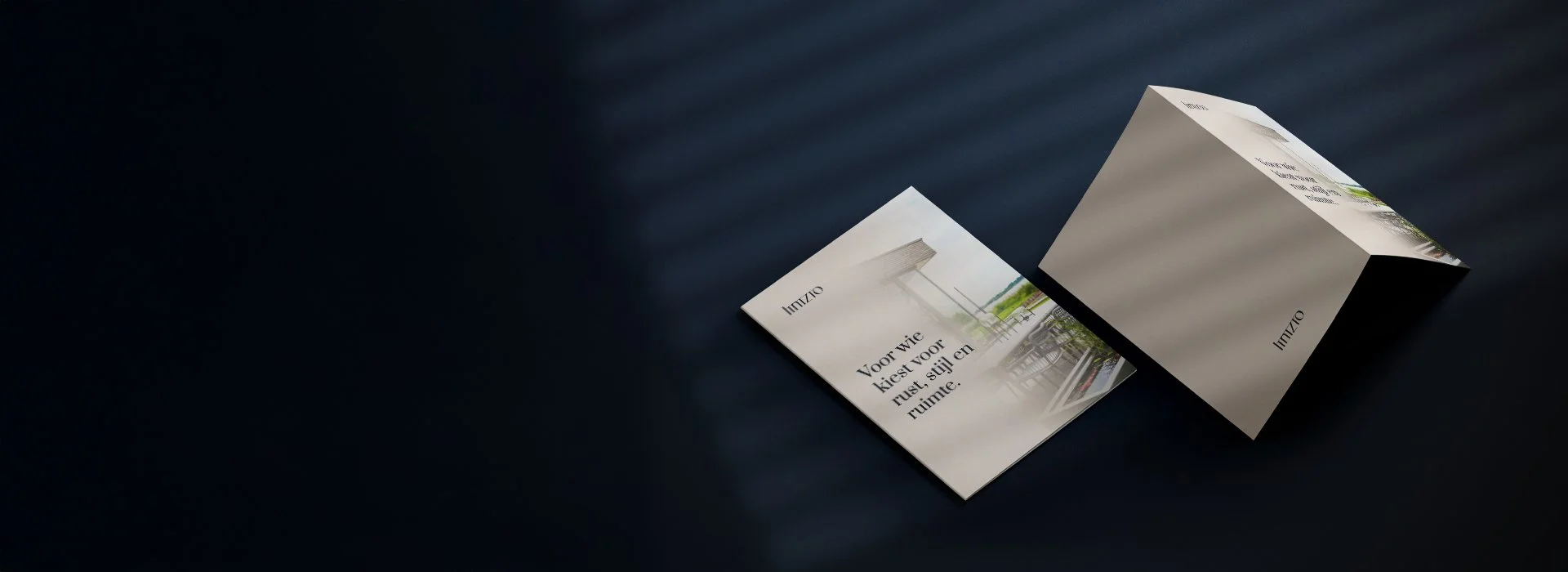
The corporate identity manual includes clear guidelines for the use of logos, margins, color variations and typographic hierarchy. It also includes a set of favicon applications and print-ready versions for both digital and physical media.
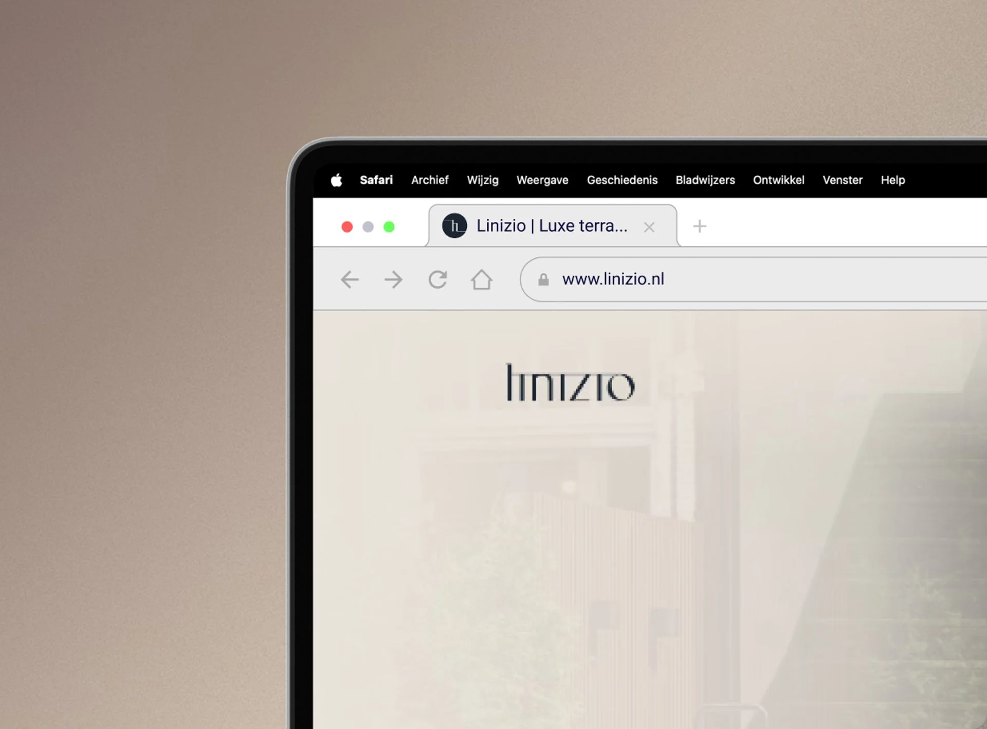
This consistent approach ensures that Linizio maintains a unified look and feel across all communication channels, from brochure to browser: reliable, stylish and thoughtful.
Result
The new corporate identity forms the solid foundation for all of Linizio’s communications. From the logo to the last detail, each element aligns with the brand values. Thanks to the comprehensive manual, Linizio can independently apply the visual identity in future expressions.
The logo was also designed in this process: a powerful and recognizable element that visually summarizes Linizio's core values.