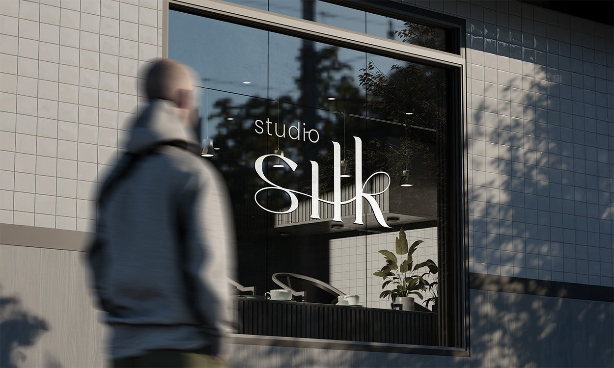
Studio Silk
Studio Silk is a new beauty salon in Oldenzaal that will open early next year. The owner, Sascha, was looking for a modern, elegant and feminine visual identity that directly matches the style of her salon. She wanted a logo and corporate identity that exude tranquility, are consistently applicable and immediately portray her brand professionally on website, social media and printed matter.
During initial contact, Sascha shared her preferences: soft beige tones, rounded shapes and a serene salon style seen in modern, minimalist beauty concepts. She sent a Pinterest board full of warm interiors, neutral palettes and sophisticated aesthetics. This board formed the basis for the creative direction.
The visual identity is built around three pillars: tranquility, femininity and modern simplicity. The color palette consists of warm neutral tones that remain timeless and fit directly with the salon's interior. The typography is elegant and clear, without unnecessary details. Round shapes and ample white space create a soft look that matches beauty, wellness and skin care.
The logo forms the core of the identity. Sleek, feminine and sophisticated, with a modern look that is instantly recognizable within the beauty industry. The entire corporate identity is designed to be scalable: from digital expressions to physical materials such as appointment cards, salon signs and packaging.
The end result is a brand identity that is professional, warm and instantly recognizable. Studio Silk will have a look and feel that inspires confidence, brings calm and fits perfectly with a modern beauty salon that puts quality and experience first.


All about documents, visual identity and brand books
-
A strong brand identity starts with a clear positioning and feel. From there, style, tone of voice and visual direction are built to form one recognizable and distinctive whole. Linizio was developed in this way as a new luxury brand within the exterior design industry.
-
Linizio targets the upper end of the market with custom canopies that bring together design, technology and experience. The branding reinforces that sense of exclusivity and trust.
-
The brochure was designed as an experience. By strategically bringing photography, layout and text together, the reader feels Linizio's brand values without explicitly mentioning them. Thus, design becomes an extension of strategy.
-
S Creations helps brands bring strategy, design and experience together. The approach is personal, focused on emotion and brand consistency so that the result not only looks beautiful but also sells and inspires trust.
-
A high-quality brochure reinforces brand perception, increases trust and ensures recognition. For Linizio, making the brand tangible to customers and partners was a crucial step.
Creating a digital experience together?

