

Prime Pilates Qatar
Prime Pilates is a boutique Pilates studio in Qatar, specializing in personal coaching for women. The studio combines movement and awareness in a high-end setting.
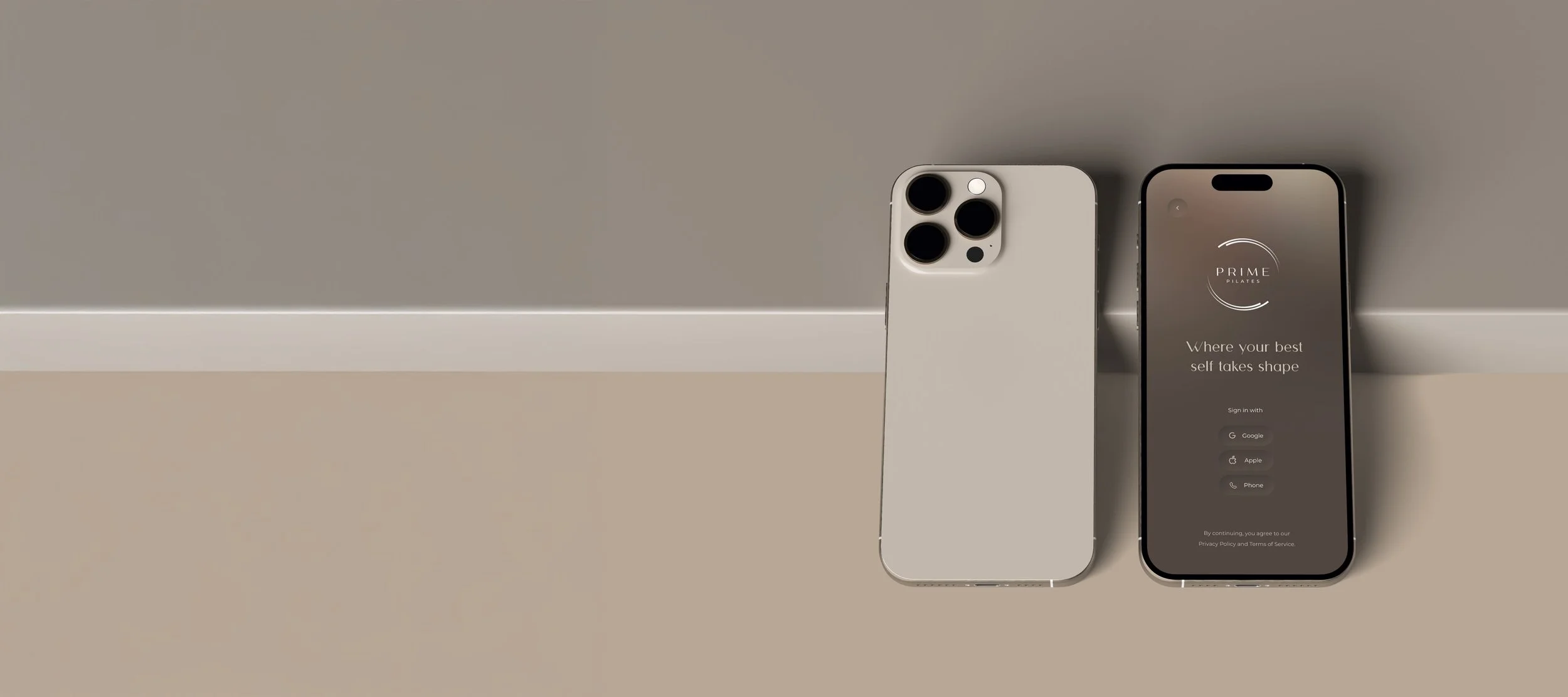
The question was to develop a complete visual identity, translated into both offline communication and a digital product. This resulted in an intensive collaboration working towards a native app, a scalable admin dashboard and a strong visual foundation.
Through weekly video calls, brand, design and technical execution were coordinated throughout the process. Direct contact with the developer ensured that design choices were visually correct. During construction we actively monitored whether the visual line was followed, with room to make timely adjustments where necessary.
Challenge
Prime Pilates was in a growth phase and needed a visual identity that was professional, calm and distinctive.
In addition to the foundation for the brand, the focus was on developing an app that digitally translates the experience of the studio. There also needed to be an internal dashboard for user management, scheduling and content. All with an eye on consistency, scalability and ease of use.

Approach
The process began with formulating a visual starting point based on target audience, positioning and brand values.
A visual identity was then developed that combines calm, strength and sophistication. This style was translated to the app and dashboard.
Within the app design, the emphasis was on simplicity, intuitive interaction and brand consistency. In collaboration with the developer, animations and behavioral elements were aligned with the design.
Throughout the process, weekly video calls tuned in to monitor progress. Design choices were discussed, interactions tested and visual guidelines monitored. Adjustments were made where necessary to ensure experience and brand consistency.
Result
A complete visual identity with a focus on balance, tranquility and high-end experience
A native app available in the App Store, designed based on the brand identity
A custom-designed admin dashboard focused on internal processes and scalability
A design process that aligns brand strategy, design and technical realization
Ongoing collaboration for visual support and consistency in communication
Frequently asked questions about app & UI/UX design,
-
UI design focuses on the visual design of an app, such as colors, typography, icons and interaction elements. The goal is to create an attractive and user-friendly interface that matches the brand identity and user expectations.
-
UI design is about how something looks, while UX design focuses on how something feels and functions. Good design combines both: a visually appealing whole that is also logical, intuitive and pleasant to use.
-
The process starts with formulating the brand strategy and visual principles. Next, wireframes, a visual concept and interactive prototypes are developed. During the process, regular consultation with the client and developer takes place to ensure that design choices are correctly translated into the technical implementation.
-
Brand consistency ensures that users immediately recognize and trust the app. Applying colors, typography and tone-of-voice consistently creates a recognizable experience that is consistent with the rest of the brand's communications.
-
Close collaboration is essential. By tuning in regularly via video calls and using design hand-offs, design details such as animations, margins and behavioral elements can be implemented correctly. This ensures the visual line is maintained during construction.
-
A high-end design combines simplicity, elegance and technical precision. Think calm layout, balanced typography and subtle animations. Everything should contribute to an intuitive user experience that feels professional and sophisticated.
-
A visual identity forms the basis for all digital expressions. Colors, logo, typography and photography are converted to a style that fits within the digital medium. In the case of an app, this means consistent buttons, icons and navigation that match the brand experience.
-
Scalability occurs when the design is built from reusable components. This ensures that the app can be easily expanded without losing its visual style. A design system or component library helps with this.
-
Good UI design makes it easy for users to understand where to click, how to navigate and what the next step is. Clear visual hierarchy, adequate white space and consistent iconography contribute to an intuitive experience.
-
A strong end result results from collaboration between designer, client and developer. Through regular coordination, the design becomes not only visually strong, but also technically feasible and user-friendly. This ensures a result that is both strategically and aesthetically right.